

Google and 1/3 of polled Americans do.

So just when you thought you had your website tweaked to perfection, those crafty folks out in Mountain View, CA have done it again…
Google has released yet another ranking factor (believe it or not, some think there are already over 200, and counting…) on that moving target known as their “search engine algorithm.” This algorithm is the semi-mysterious, statistics-driven digital judge and jury that ultimately decides where your website ranks (or tanks) on Google’s search engine results pages (SERPs).
Google’s big mobile push
As of April 21, 2015, Googlers (seriously, that’s what Google employees are known as) are asking website owners to make sure their sites are responsive AND mobile-friendly.
Okay, Google is doing more than just asking, they’re actually telling folks that a responsive website will rank higher in the SERPs. In their official Webmaster Central Blog, Google spells it out, “…we will be expanding our use of mobile-friendliness as a ranking signal (factor). This change will affect mobile searches in all languages worldwide and will have a significant impact in our search results.”
So what does this mean for the typical small business owner with a website?
In a nutshell, it means that it’s time to trade in your older website design for a mobile-friendly website version – a responsive one optimized for viewing on all sorts of mobile devices like smart phones, tablets and phablets.
Desktop vs. mobile website design – what’s the difference?
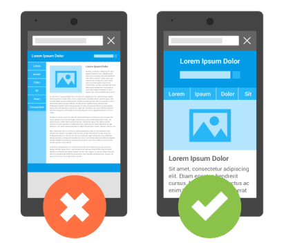 Desktop vs. mobile website design – what’s the difference?
Contrary to popular belief, mobile-friendly websites aren’t just ‘lite’ versions of ‘regular/desktop’ sites. A truly mobile-friendly, responsive website is specifically designed to be fully functional on small touchscreens. Mobile-friendly website design focuses on details like easy-to-see fonts, intuitive radio buttons and low data usage, as well as click-to-call features, integrated maps and simple navigation.
What happens to websites that aren’t mobile-friendly?
While nobody expects that the SERPs will see dramatic changes on April 21st, Google has made it clear that they’re committed to providing users with “the most relevant and timely results, no matter if the information lives on mobile-friendly web pages or apps.”
We expect that websites that aren’t up to snuff will see a slow, but steady pattern of penalties; declining traffic, dropping SERP rankings and higher PPC costs are all strong possibilities for businesses without a responsive website. Of course eventually, lower SERPs result in decreased site traffic, which also affects leads, sales and ultimately, profits.
They’ll have to pry my phone out of my cold, dead hands first
That’s how a lot of people feel about giving up their mobile devices. And here are some stats to ponder. According to the Pew Research Center, as of October 2014, approximately two-thirds of all American adults owned an Internet-enabled mobile phone (smartphone) and about one-third report using the device as their primary way for accessing the Internet.
We know mobile website design
Small business owners who want to market online need to respond by trading in their old website models for a new responsive, mobile-friendly model. Need a hand upgrading your website to meet Google’s new standards? Let’s talk… it’s time to test drive a new website model.