

By Jamie Phelan, Northland CAPS Associate – Global Business & Logistics & EAG’s spring intern
When an advertising and marketing agency creates a logo, website and brand identity for your company, there are many decisions to weigh. How can their creative team portray your company’s culture to your consumers with green? Or, will blue and yellow create a better face for your company that fits its identity? How will red catch a consumer’s attention? Yes, there are sizeable words you can use from the dictionary to fully describe your company, but you can also create a brand identity by the palette of colors you select.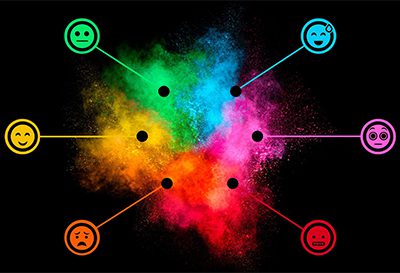
Not only do colors grab the consumer’s eye, they also form a crucial first impression for clients about your company. That is why EAG Advertising & Marketing, a digital marketing agency, chooses the most telling colors when creating an advertising campaign for a client. Think of the color like a statement. When clicking through a company’s website, your brain will automatically make a snap judgement of the company’s culture through the colors they used on their site.
Let us dive into the basics. Colors give off a feeling. Take the Sprint logo for example before the T-Mobile merger. How did the logo make you feel? No, not gloomy or angry. Just by looking at it, it gave off a sense of optimism. That is what yellow does. It gives a person a feeling of optimism, clarity and warmth. Using yellow was Sprint’s way of getting their clients to feel happy purchasing their product.
Brands also aim for their clients to feel like they can trust them. There is a color to do that, too. Think of what Dell, Twitter, Oreo and Lowe’s all have in common. Their ability to gain a client’s trust and portray strength and dependability is based on blue. Blue also is commonly used for healthcare companies to make patients feel safe and earn their trust.
How about Target, Pinterest and CNN? They use red in their logo. Red gives the consumer an impression of excitement and boldness. It also creates a feeling of urgency. Therefore, companies use red to promote sales. It allows consumers to feel like they need the product as soon as possible since red creates urgency.
Orange portrays a friendly and confident ambiance. Purple gives the consumer a sense of creativity. Green symbolizes health, growth and peace. Neutral colors like white, black, and silver promote balance and calmness.
Now what about Google, NBC, Microsoft and eBay? They include multiple colors of the rainbow. This gives the consumer a feeling of diversity. Yes, they want you to feel all the emotions. Boldness, creativity, optimism, trust, peace; everything.
All these colors bring up specific feelings about a brand for consumers. Even though it may seem like a simple task, graphic designers pay exceptional attention to the palette they choose because it will represent their clients’ companies in a certain light.
Pay close attention the next time you choose one company over another. Are the colors of the brand identity influencing your decision? You may or may not even realize the effect the colors have on your choices, but that’s part of the psychology of color.
Unsure if your small business’s brand color palette is as effective as possible at giving the right impression to promote your sales and brand recognition? Let’s talk about it.